
Event Tips
Wedding Linen Color Guide for a Polished Reception
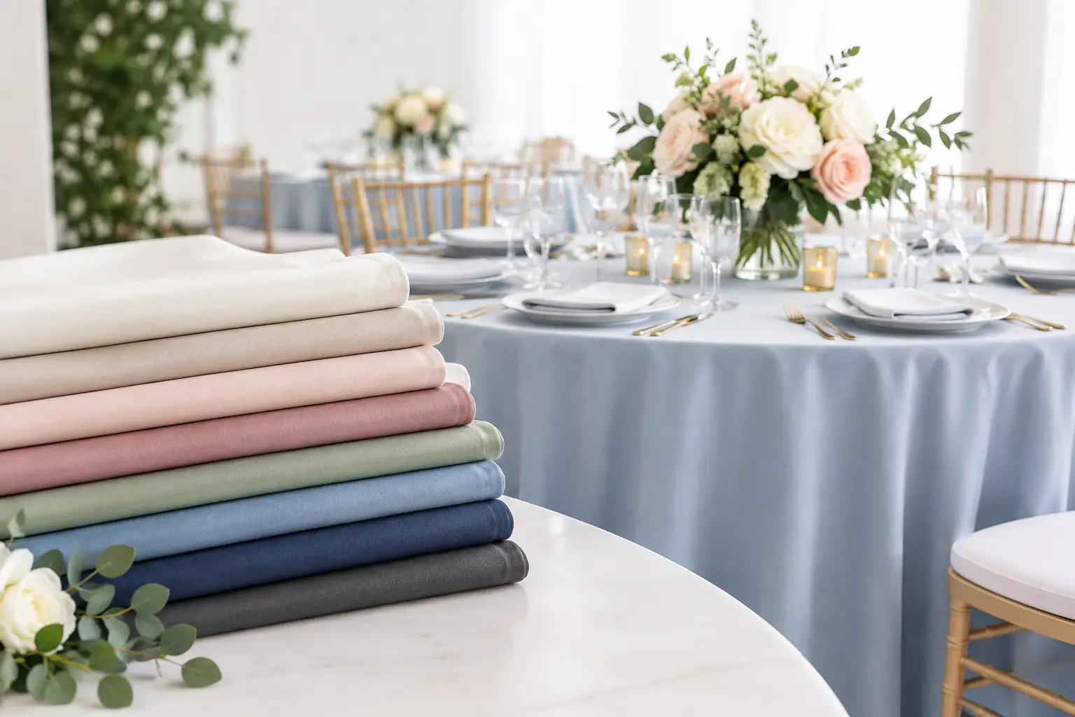
A reception can have beautiful flowers, great food, and a wonderful venue, yet still feel unfinished if the tables do not work together. This wedding linen color guide helps you choose tablecloths, napkins, runners, and overlays that support your wedding style without competing with everything else you have planned.
Linens cover more visual space than many couples expect. They set the background for place settings, centerpieces, chairs, and food service, so the color you choose can make a room feel brighter, warmer, more formal, or more relaxed. The goal is not to match every detail exactly. It is to create a coordinated setting that looks intentional in person and in photos.
Start Your Wedding Linen Color Guide With the Venue
Before choosing a palette from a social media post or floral inspiration board, look closely at your venue. Its wall colors, flooring, lighting, ceiling height, and existing furniture will all affect how a linen color appears.
A ballroom with warm beige walls and gold fixtures often works naturally with ivory, champagne, dusty blue, sage, burgundy, or rich navy. A modern venue with white walls, concrete floors, and black accents can carry crisp white, black, slate gray, emerald, or jewel tones. For an outdoor Arizona wedding, consider the landscape and the time of year. Terracotta, sand, rust, muted peach, olive, and soft neutrals can feel especially at home in desert settings, while lighter shades help daytime celebrations feel cool and open.
Lighting deserves equal attention. A soft ivory linen may look nearly white in bright daylight but take on a golden cast under warm indoor lighting. Navy can read elegant and deep in the evening but almost black in a dim room. Whenever possible, view linen swatches at the venue or compare them in lighting similar to your reception. This small step prevents surprises on the wedding day.
Let the Table Shape Guide the Look
Color is only part of the decision. A floor-length tablecloth creates a formal, finished foundation and is especially effective for head tables, cake tables, gift tables, and guest tables in a ballroom. On a rustic farm table, a runner may be all you need to preserve the wood surface while adding color and texture.
Round guest tables tend to look best with one strong base linen and a simple napkin treatment. Long banquet tables give you more room to layer runners, greenery, candles, and place settings. If your tables are different shapes, use one consistent linen family to make the room feel connected.
Choose a Main Color, Then Add Supporting Shades
One of the most common planning mistakes is trying to give every wedding color equal attention on every table. Instead, choose a primary linen color and use one or two supporting shades. This keeps the design polished and makes ordering simpler.
For a timeless formal reception, white or ivory tablecloths are dependable choices. They keep the room bright, complement nearly any floral palette, and allow your napkins, chargers, centerpieces, or chairs to provide contrast. Ivory is usually more forgiving than bright white in warm lighting and can feel softer alongside champagne, blush, gold, or natural wood.
A colored tablecloth makes a stronger statement. Navy creates structure for coastal, classic, and evening weddings. Black can be sleek and dramatic, particularly with white flowers, clear glassware, or metallic details. Sage works beautifully with garden-inspired florals and natural textures. Dusty blue, mauve, and muted lavender create a romantic look without becoming overly sweet.
If you want a bolder tablecloth, keep other large elements calm. For example, emerald linens pair well with ivory napkins, gold flatware, and white flowers. A burgundy linen can look refined with soft blush or champagne napkins rather than another saturated red. Contrast is what gives a table dimension.
Use Napkins for Controlled Color
Napkins are one of the easiest ways to introduce a wedding color without committing to it across the entire room. They occupy less space than tablecloths, are easy to coordinate with place settings, and can be folded or styled to suit the formality of the event.
A white or ivory tablecloth with terracotta napkins is a warm option for a fall or desert-inspired celebration. With sage napkins, the same neutral base becomes garden-inspired. With black napkins and gold details, it becomes modern and formal.
Consider the food service, too. Very pale napkins can show stains more readily at a dinner reception, while very dark napkins may shed lint if the fabric quality is poor. A professional rental inventory should arrive clean, pressed, and ready for placement, which matters when linens are part of the first impression guests receive.
Match Linen Color to Your Wedding Style
The right color combination depends on the atmosphere you want guests to feel when they enter the room.
For a classic wedding, begin with white, ivory, champagne, navy, black, or soft blush. These colors photograph well and hold up across changing trends. Add interest through texture, such as a satin overlay, a subtle patterned runner, or a folded napkin with a menu card.
For a romantic wedding, build around softer tones such as dusty rose, mauve, lavender, light blue, sage, or warm ivory. Avoid using several pale shades with no contrast. A romantic table still needs definition, which can come from dark chargers, gold flatware, greenery, or candles.
For a modern wedding, use clearer contrast and cleaner combinations. Black and white, ivory and espresso, white and emerald, or slate and soft gray can look sharp without feeling cold. Keep the palette focused, and repeat the same colors throughout signage, menus, linens, and floral accents.
For a rustic or bohemian celebration, choose colors that connect to natural materials: terracotta, sand, olive, taupe, rust, cream, and muted mustard. Textured runners and neutral base cloths often work better than shiny fabrics. The look should feel relaxed, but the tables still need enough consistency to look deliberate.
For a glamorous evening reception, richer color and sheen can be appropriate. Deep plum, navy, emerald, black, wine, or chocolate brown can create a dramatic base. Use metallic accents carefully. Gold, silver, and rose gold can elevate the setting, but mixing all three can make the table feel busy unless there is a clear design reason.
Think About Season Without Being Limited by It
Seasonal color guidance is useful, but it should not become a rulebook. Spring often favors soft greens, blush, pale yellow, lilac, and light blue. Summer can support brighter coral, citrus tones, turquoise, or crisp white. Fall naturally suits rust, wine, terracotta, olive, and warm neutrals. Winter lends itself to deep blue, emerald, black, plum, silver, and ivory.
Still, a winter wedding can be light and airy, and a summer wedding can be formal and moody. Your venue, ceremony time, and personal style matter more than the calendar. In the Phoenix area, where outdoor temperatures and sunlight can be intense, lighter linens for daytime events can help a setup feel more comfortable visually. Deeper tones often shine at sunset or in climate-controlled indoor spaces.
Avoid These Linen Color Problems
A cohesive reception does not require identical linens on every table, but it does require a plan. Avoid pairing too many unrelated undertones. Cool gray, stark white, cream, and warm beige can clash when used randomly, even though they all appear neutral at first glance.
Be cautious with matching bridesmaid dresses exactly. Fabric dyes, textures, and lighting vary, and an exact match can look accidental if the shades are slightly off. It is usually better to choose a complementary version of the wedding color. For example, pair dusty blue dresses with slate or navy linens, or burgundy dresses with wine, blush, or ivory table details.
Also consider what will sit on the linen. A highly patterned cloth may disappear under large centerpieces and place settings, while a busy floral arrangement can compete with a bold runner. If your flowers are colorful and abundant, simpler linens give them room to stand out. If your floral design is minimal, linens can provide more of the visual impact.
Plan the Full Room, Not Just One Table
Before finalizing your rental order, picture the entire reception: guest tables, sweetheart or head table, cake table, gift table, buffet, bar, and welcome table. These areas do not need identical linen treatments, but they should belong to the same palette.
A helpful approach is to use a neutral base on guest tables, then reserve a specialty linen or richer color for focal points. Your sweetheart table and cake table are photographed frequently, so they are natural places to add an overlay, runner, or a more distinctive shade. Buffets and beverage stations should look coordinated while remaining practical for service.
Ordering through a full-service rental partner also makes the process easier. Royalty Rentals can help couples compare linen options with tables, chairs, and reception equipment in mind, then arrange delivery before the event date and optional setup according to the plan.
The best linen colors are the ones that make your guests notice the celebration, not the effort behind it. Choose a palette that feels like you, test it in your venue lighting, and let each table support the warm, memorable reception you are creating.